YEARS: 2024-2025

Revving Up The Results

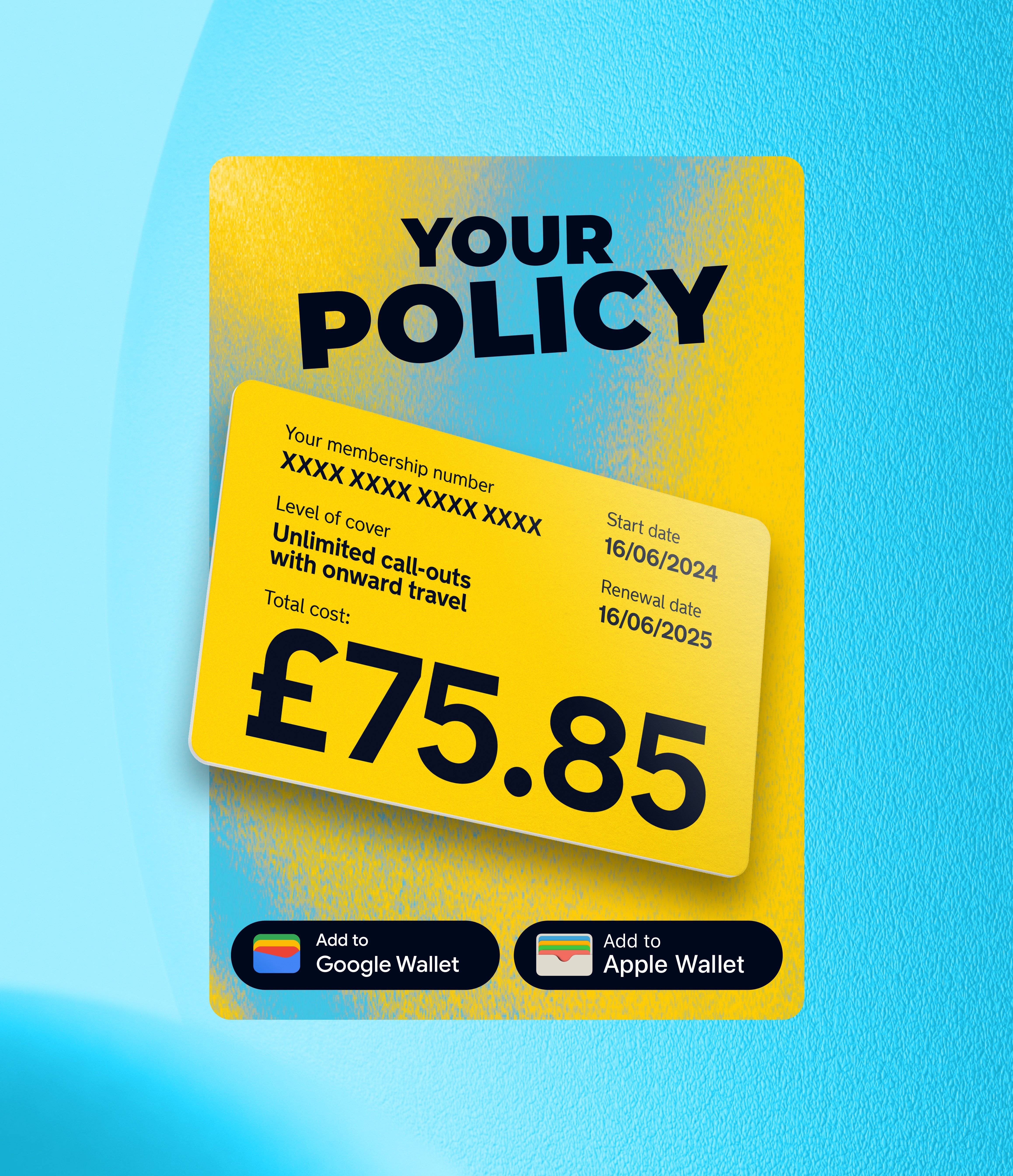
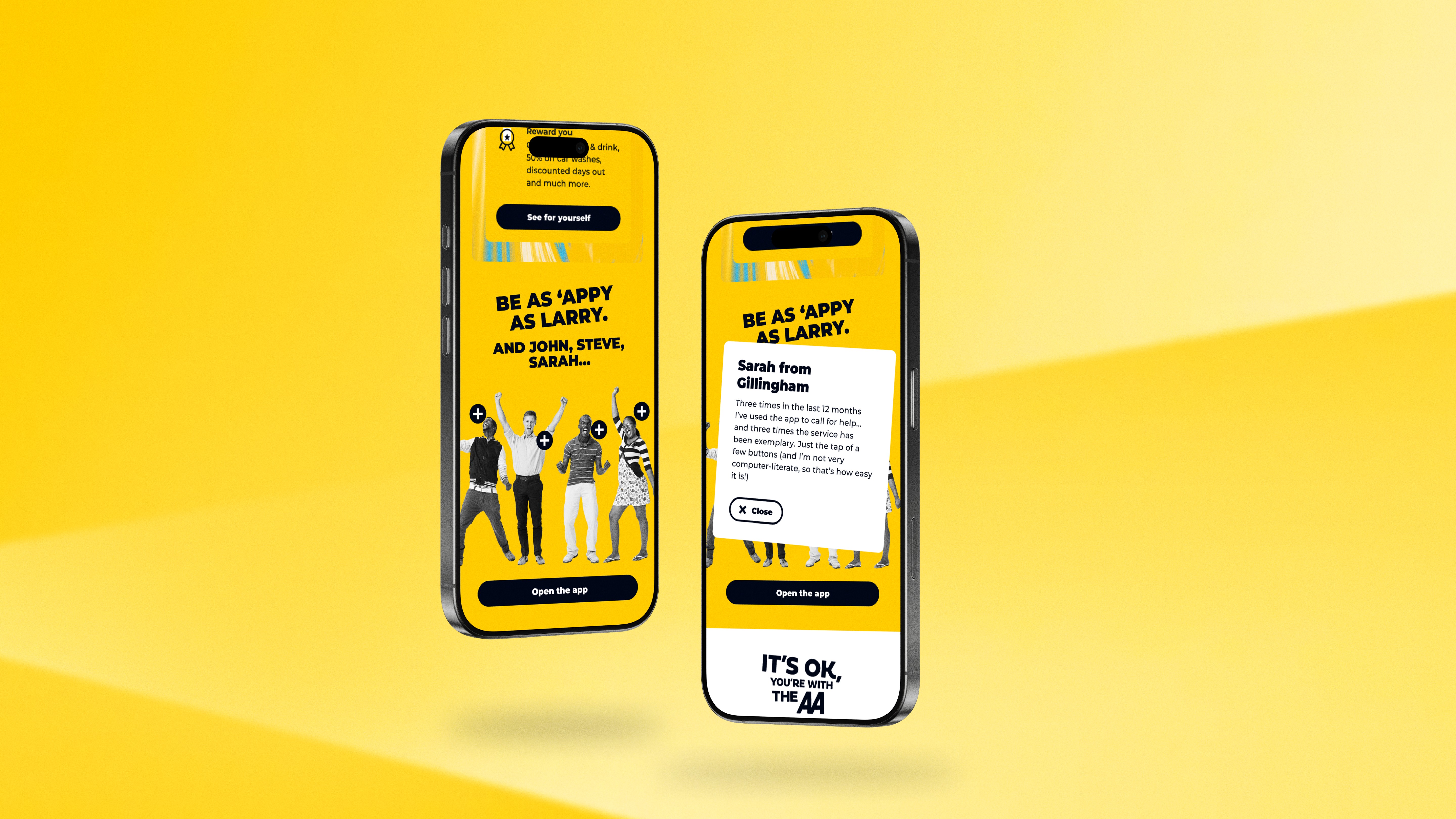
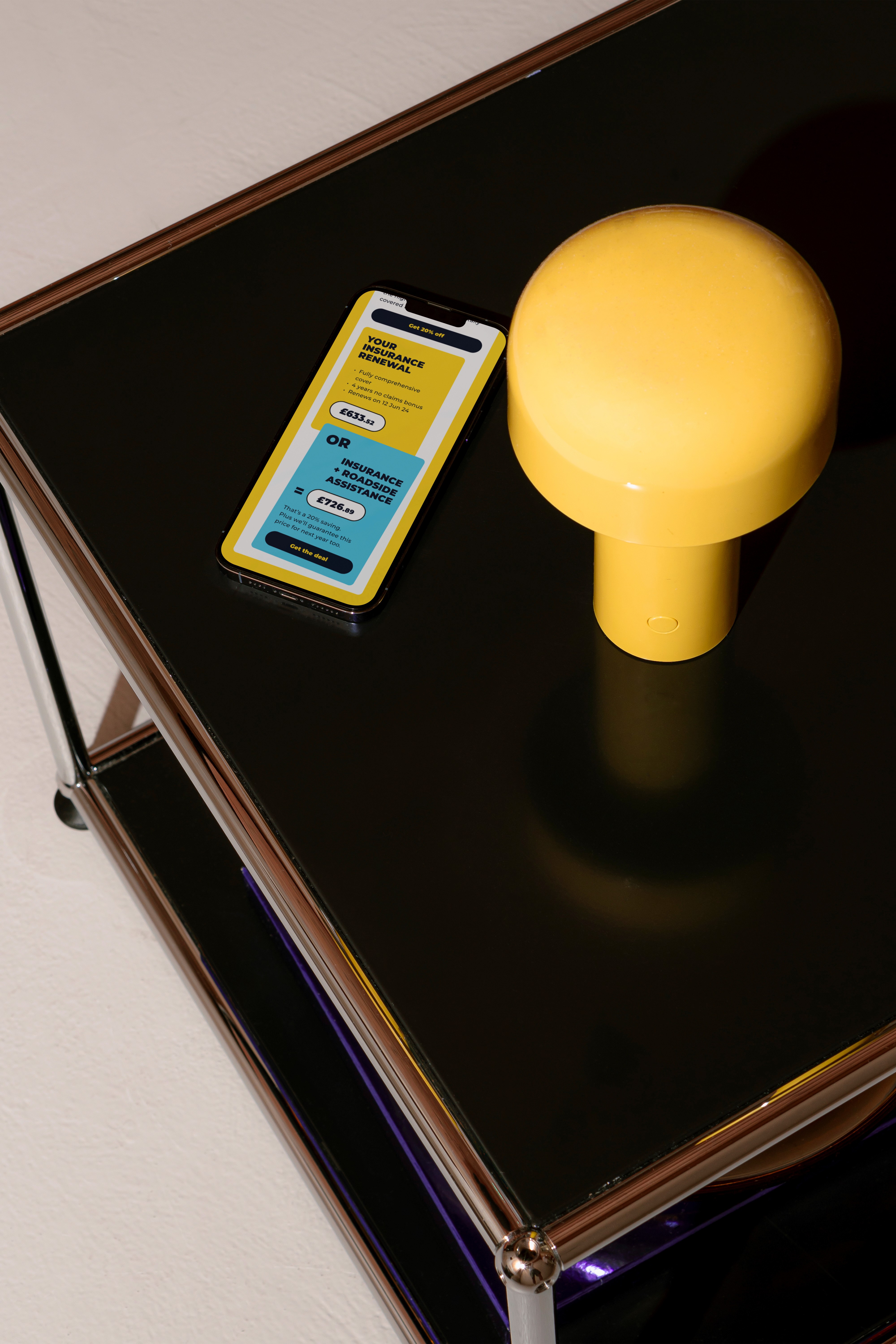
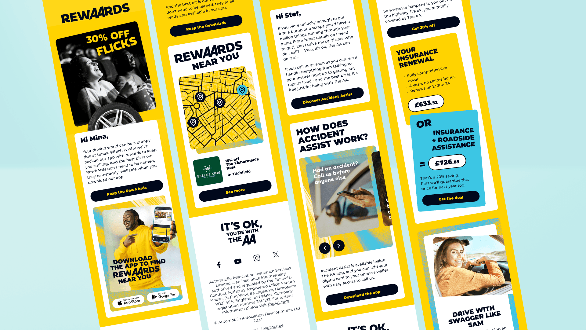
The AA’s ATL campaign promised reassurance: “You’ll be ok with The AA.” But this feeling wasn’t carrying through to the CRM experience. My task was to help bring that promise to life through digital design - to build trust, clarity and connection in CRM that would drive engagement and brand loyalty. Designing clear, engaging templates and journeys. Aligning visual tone with ATL, while tailoring for email UX. Building scalable, human-centred design that felt personal.

[previous works]

While the emails maintain strong brand recognition through colour and tone, the layouts feel visually dense and inconsistent across messages. The hierarchy could be clearer, some sections compete for attention, and key CTAs are easily overlooked due to lack of contrast or placement.

Repetition of similar content blocks and uneven use of whitespace create cognitive load. The overall structure didn’t fully support a clear journey or progression from one email to the next, which can limit engagement and reduce clarity.

Process–Resolution

Process–Resolution

Since rolling out the new designs, they've been a massive hit, and the numbers don’t lie. We’ve gone from 2k interactions on one email to a jaw-dropping 70k! I created a flexible library of CRM components, including headers, CTAs, image blocks, and footers, that could adapt to different message types and audience needs. Bringing consistency to the designs and speeding up production.Focusing on understanding the audience at every stage. Rounded buttons, familiar imagery, and a simplified layout helped create a sense of ease - crucial during stressful moments like a roadside breakdown. Introduced interactive elements like carousels, hotspots, polls, and quizzes to encourage customers to engage more actively with the emails and make the experience feel more personal and dynamic.