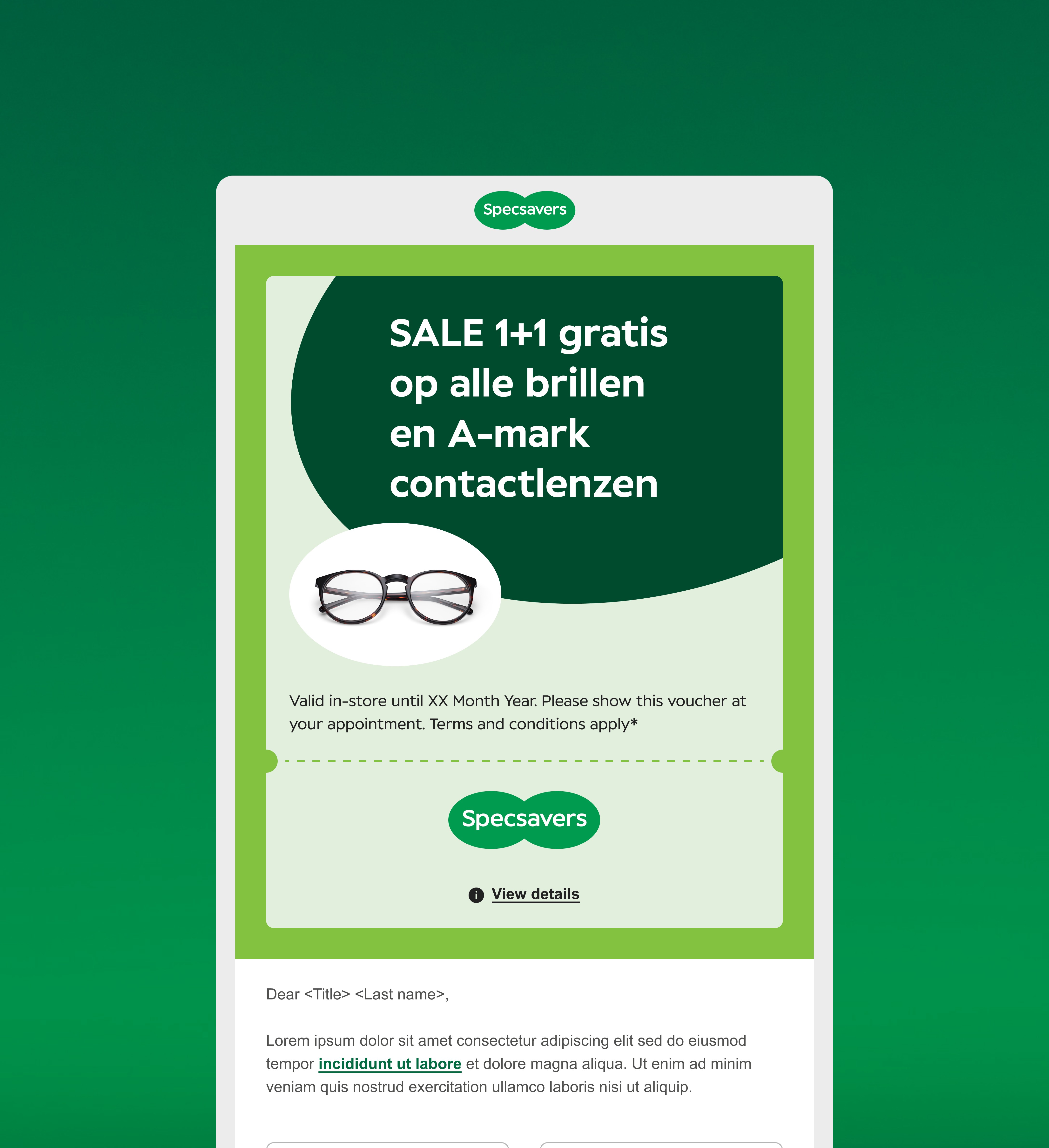
The previous designs weren’t built with the full customer journey in mind and lacked a consistent system. They used outdated visuals, clunky layouts, and rigid templates that didn’t flex across different types of comms. This made the experience feel disjointed, limited our ability to personalise, and slowed down production.
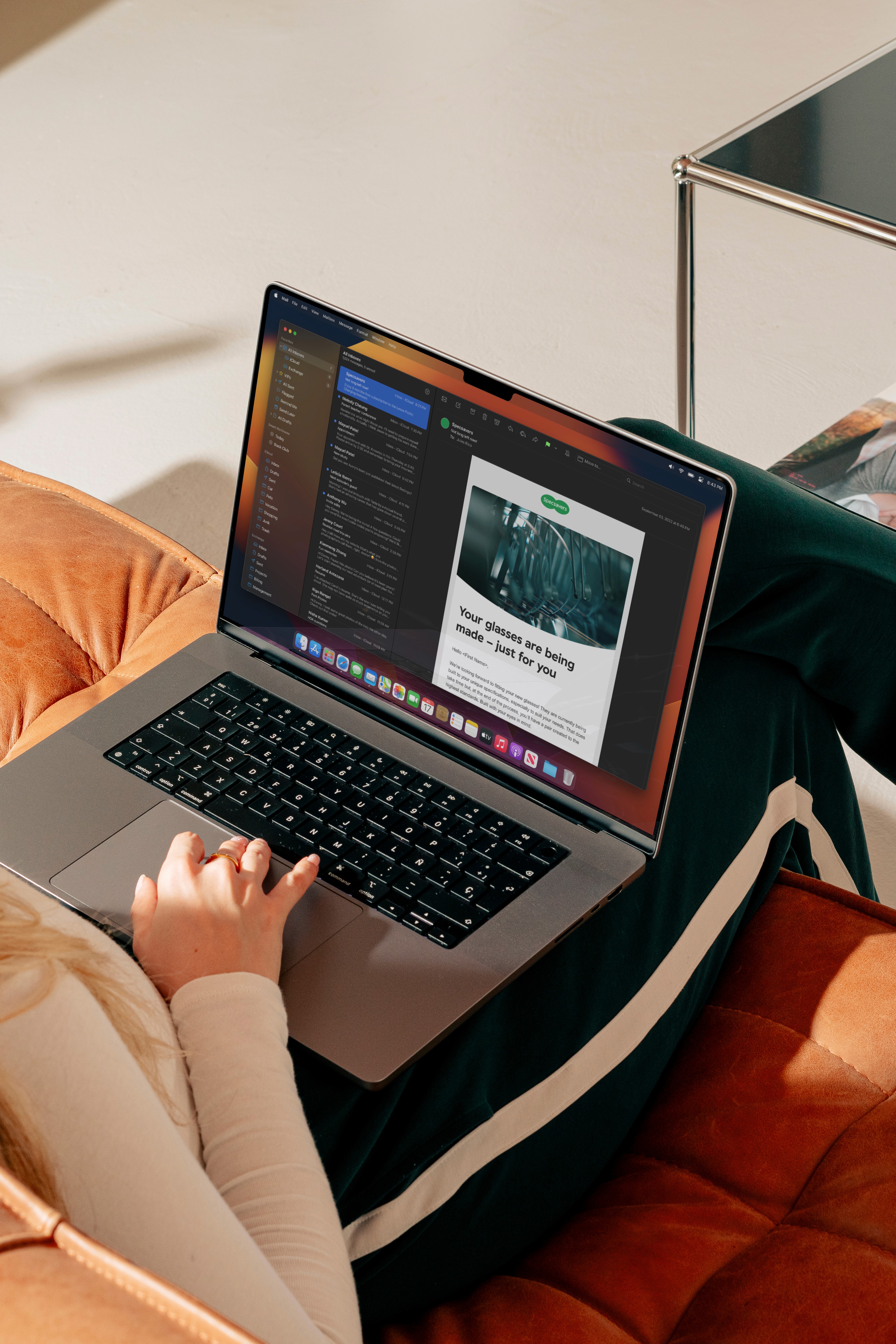
Even the CTA's weren't mobile-friendly, and didn’t meet accessibility best practices. A modular approach for both desktop and mobile, ensuring compatibility and optimal user experience across different devices.